Be yourself; Everyone else is already taken.
— Oscar Wilde.
This is the first post on my new blog. I’m just getting this new blog going, so stay tuned for more. Subscribe below to get notified when I post new updates.
Be yourself; Everyone else is already taken.
— Oscar Wilde.
This is the first post on my new blog. I’m just getting this new blog going, so stay tuned for more. Subscribe below to get notified when I post new updates.

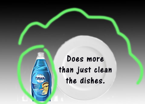
I decided to do Dawn dish soap and then recreate the ad. I found this on a website and when you go to it it will show you the original commercial for it, it is fun to watch.
: https://www.youtube.com/watch?v=3nfoX6STL7U
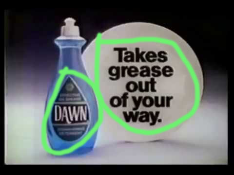
I the text in this is ad is Alignment. It communicates clearly and it is telling you what the product does, or what to do.
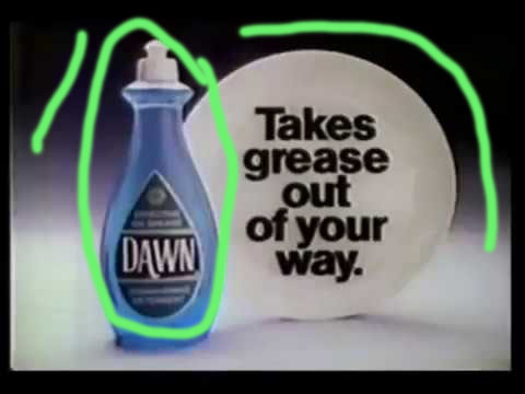
I like how they used black and white and focused on the dish soap with the blue standing out, it will stick in your mind and you will remember what color of soap to buy.
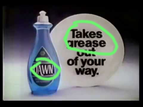
I think the typography that this ad shows is oldstyle on the Dawn bottle and Modern style on the plate.
My Ad of dawn dishsoap
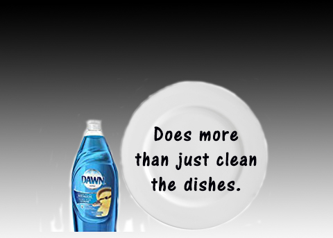
I recreated the ad and added a brighter blue bottle and softer on the black and white. Changed the wording to fit in with todays time.

I did alignment with my soap and my writing on the plate.
I choose a brighter blue bottle and kept the black and white background but softened it a little to make the soap stand out.
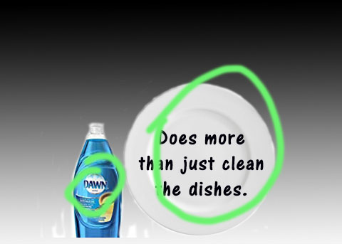
I felt that the typography on the soap was oldstyle, so i matched the contrast on my plate to the original and used modern style writing.
I feel that the original and new ad work together they have the same style and both give a clear and direct message and catches your eye.
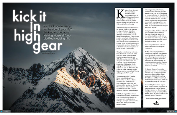
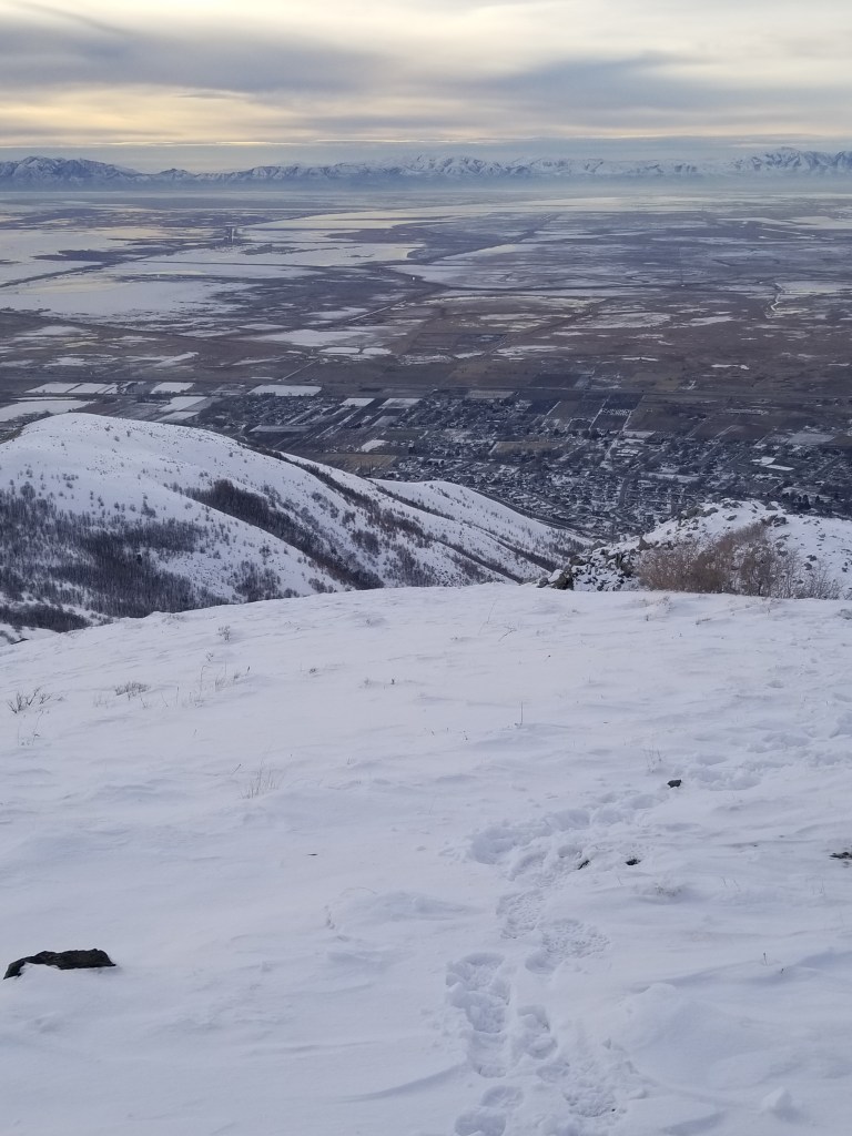
I choose this mountain seen from this ski magazine spread, because I love the mountains. I enjoy hiking and snowshoeing. Article and design page by: Alyssa Goch. I couldn’t find who the photo was taken by. https://www.behance.net/gallery/1025243/Ski-Mag-Spread-Layout
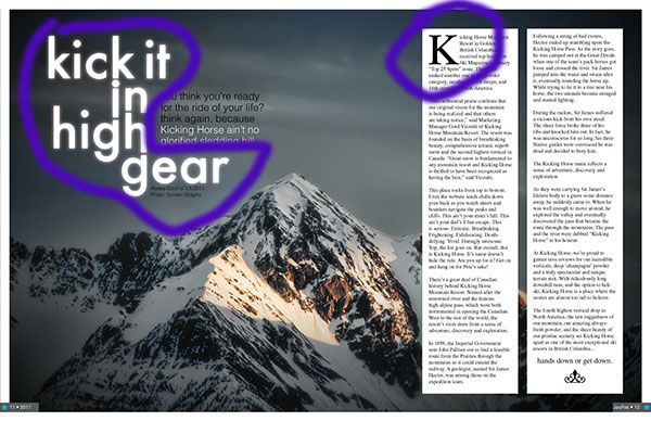
The two typefaces I think that are used here are Slab Serif and Oldstyle. I think the writing that is circled on the left is Slab Serif because it has a thick/thin lines a clean and straight forward look. Easy to read. The “K” that is circled on the right I think is Oldstyle there’s an angle at the ends of the K. It goes from thin to thicker.

I think that the two typefaces that they used were contrast. Both styles are pleasing to the eye and you are not confused. The lines have similar weight and thickness to them. It does not take away from the picture of the mountains but has you interested in what this is about.

I feel this picture uses the the rule of thirds, the peak of the main point of the mountain is at the intersection of the grid.
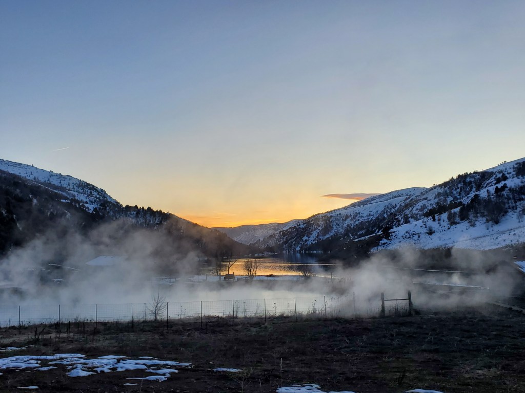
Alternate Images for the layout
Depth of field: I feel that this would work giving the idea of what it is like to be on top of the mountain that they are talking about, and the view you would see.

The Rule of Thirds: I feel this would work giving an idea of what the mountain is about and the thrill of it.
Leading Lines: I think this picture gives you a different angle of the mountain, seeing it from the ground and the beauty it really does hold. The excitement of getting to the top.
Summary
Using the photography of Leading Lines, Rule of thirds, and Depth of field along with the two different typefaces of Slab serif and Oldschool I think the magazine spread is appealing to the eye and draws the audience in to want o read about this adventure of skiing on the mountain “Kicking horse”.

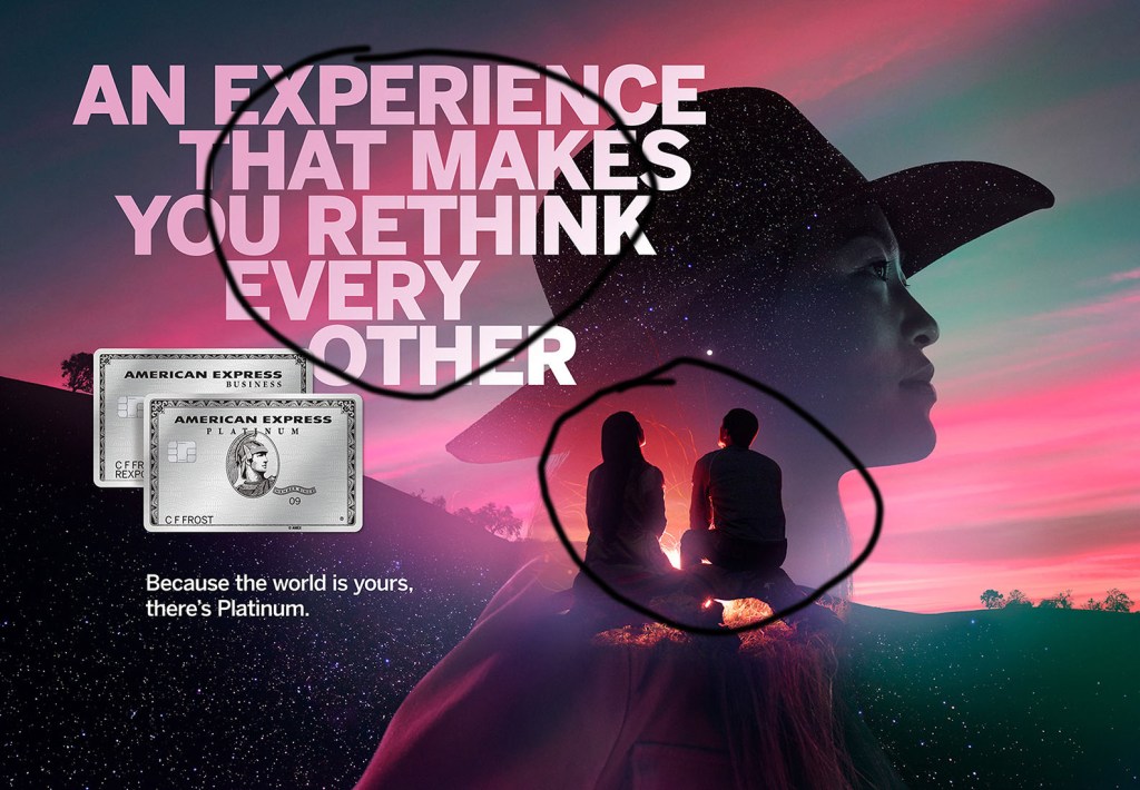
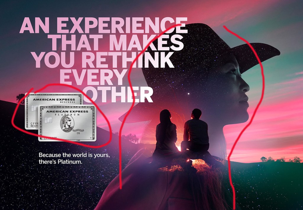
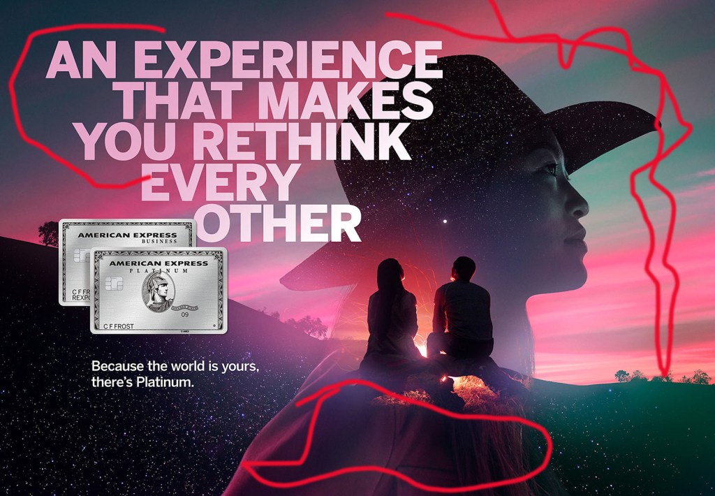
This is an ad for American Express. Jake Stangel is the photographer for the ad, I posted the link to his blog. Ogilvy and Mathers wrote the campaign for the American Express Platinum. https://jakestangel.com/American-Express-Platinum
CONTRAST
In this picture you can see the wording go from dark to light. The couple sitting the color is darker but you can tell that it is a boy and a girl.
REPETITION
Notice the repetition of the stars on the hat and the bottom of the picture, repetition of the colors being blue and pink. The American Express card is also duplicated.
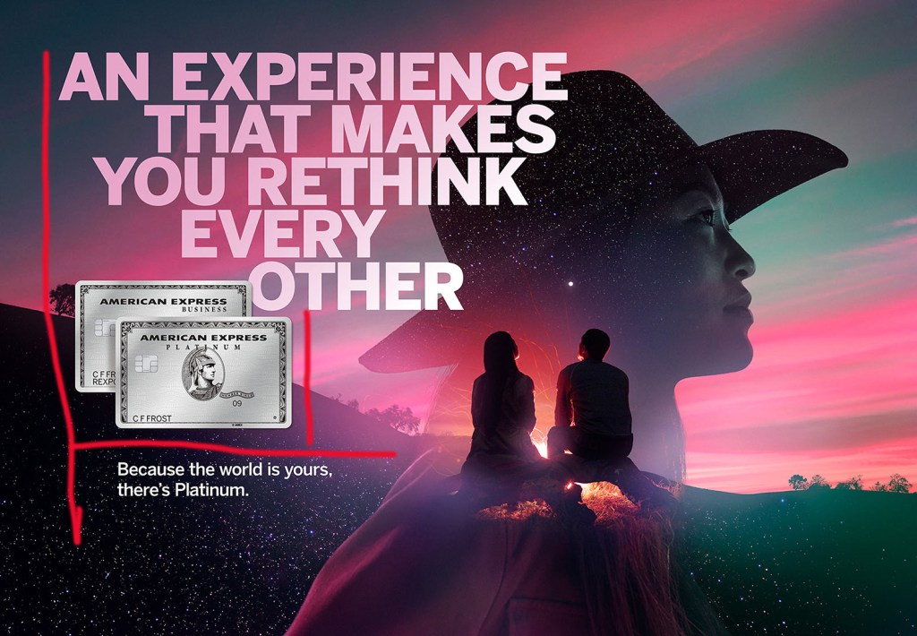
ALIGNMENT
The words are aligned left. The text on the top and bottom align with the cards, you can tell that all three are separate things.
PROXIMITY
The picture of the girl looking at herself, looking at the world. The two American Express cards also is proximity.
COLOR
The colors are consistent in the picture, they have used the pink color in the shirt of the girl and also the letters. The blue also gives the cards a blue hue to them.
When you think of American Express you usually think of the tag line “Don’t leave home without it”. I like this ad because they used all the elements I talked about. This ad truly does make me think about the possibilities of experiences I can have.
This is an example post, originally published as part of Blogging University. Enroll in one of our ten programs, and start your blog right.
You’re going to publish a post today. Don’t worry about how your blog looks. Don’t worry if you haven’t given it a name yet, or you’re feeling overwhelmed. Just click the “New Post” button, and tell us why you’re here.
Why do this?
The post can be short or long, a personal intro to your life or a bloggy mission statement, a manifesto for the future or a simple outline of your the types of things you hope to publish.
To help you get started, here are a few questions:
You’re not locked into any of this; one of the wonderful things about blogs is how they constantly evolve as we learn, grow, and interact with one another — but it’s good to know where and why you started, and articulating your goals may just give you a few other post ideas.
Can’t think how to get started? Just write the first thing that pops into your head. Anne Lamott, author of a book on writing we love, says that you need to give yourself permission to write a “crappy first draft”. Anne makes a great point — just start writing, and worry about editing it later.
When you’re ready to publish, give your post three to five tags that describe your blog’s focus — writing, photography, fiction, parenting, food, cars, movies, sports, whatever. These tags will help others who care about your topics find you in the Reader. Make sure one of the tags is “zerotohero,” so other new bloggers can find you, too.
