
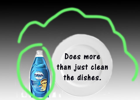
I decided to do Dawn dish soap and then recreate the ad. I found this on a website and when you go to it it will show you the original commercial for it, it is fun to watch.
: https://www.youtube.com/watch?v=3nfoX6STL7U
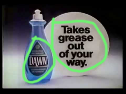
I the text in this is ad is Alignment. It communicates clearly and it is telling you what the product does, or what to do.
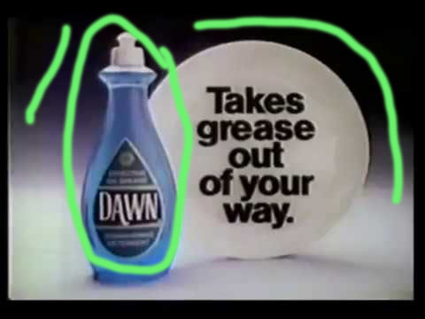
I like how they used black and white and focused on the dish soap with the blue standing out, it will stick in your mind and you will remember what color of soap to buy.
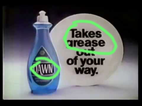
I think the typography that this ad shows is oldstyle on the Dawn bottle and Modern style on the plate.
My Ad of dawn dishsoap
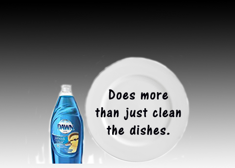
I recreated the ad and added a brighter blue bottle and softer on the black and white. Changed the wording to fit in with todays time.

I did alignment with my soap and my writing on the plate.
I choose a brighter blue bottle and kept the black and white background but softened it a little to make the soap stand out.
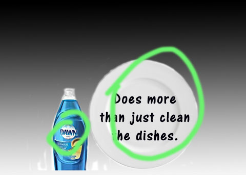
I felt that the typography on the soap was oldstyle, so i matched the contrast on my plate to the original and used modern style writing.
I feel that the original and new ad work together they have the same style and both give a clear and direct message and catches your eye.
