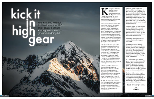
I choose this mountain seen from this ski magazine spread, because I love the mountains. I enjoy hiking and snowshoeing. Article and design page by: Alyssa Goch. I couldn’t find who the photo was taken by. https://www.behance.net/gallery/1025243/Ski-Mag-Spread-Layout
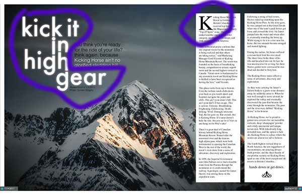
The two typefaces I think that are used here are Slab Serif and Oldstyle. I think the writing that is circled on the left is Slab Serif because it has a thick/thin lines a clean and straight forward look. Easy to read. The “K” that is circled on the right I think is Oldstyle there’s an angle at the ends of the K. It goes from thin to thicker.

I think that the two typefaces that they used were contrast. Both styles are pleasing to the eye and you are not confused. The lines have similar weight and thickness to them. It does not take away from the picture of the mountains but has you interested in what this is about.

I feel this picture uses the the rule of thirds, the peak of the main point of the mountain is at the intersection of the grid.
Alternate Images for the layout
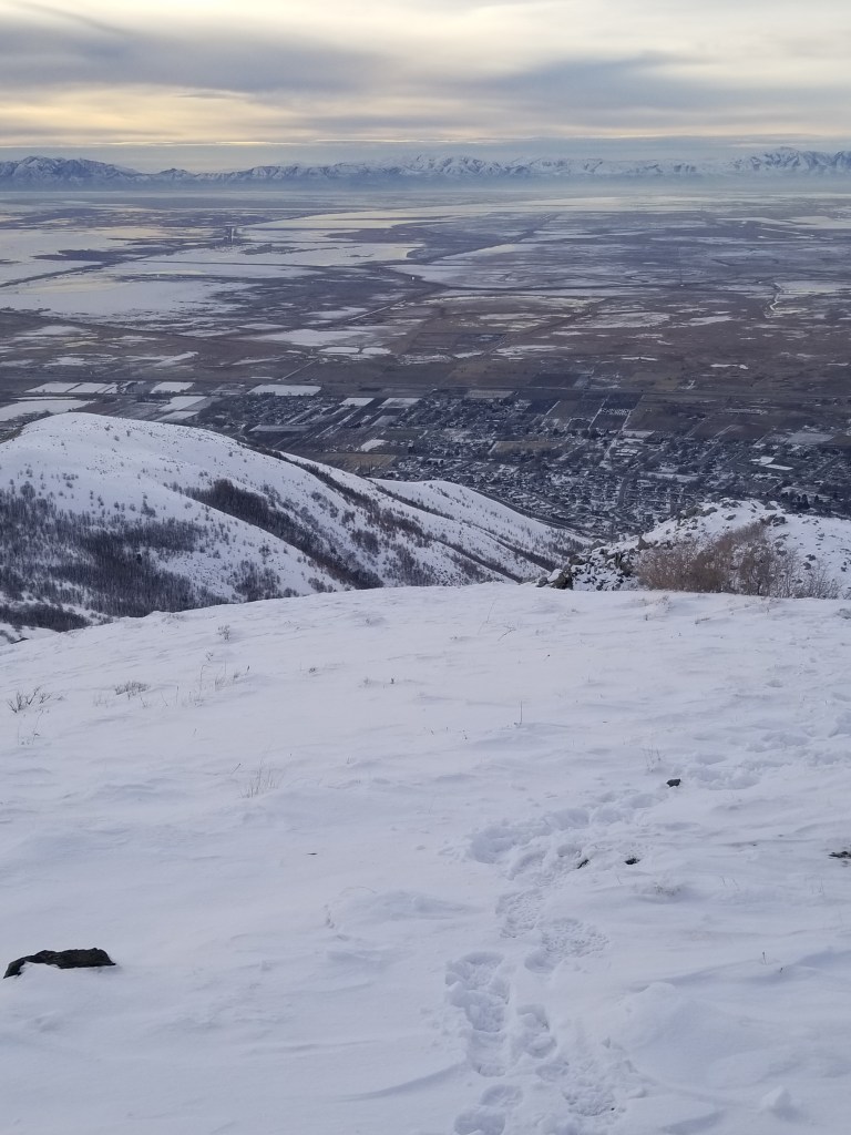
Depth of field: I feel that this would work giving the idea of what it is like to be on top of the mountain that they are talking about, and the view you would see.

The Rule of Thirds: I feel this would work giving an idea of what the mountain is about and the thrill of it.
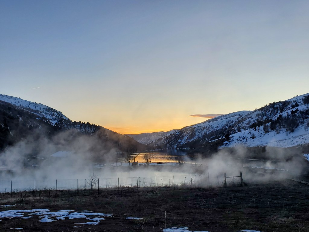
Leading Lines: I think this picture gives you a different angle of the mountain, seeing it from the ground and the beauty it really does hold. The excitement of getting to the top.
Summary
Using the photography of Leading Lines, Rule of thirds, and Depth of field along with the two different typefaces of Slab serif and Oldschool I think the magazine spread is appealing to the eye and draws the audience in to want o read about this adventure of skiing on the mountain “Kicking horse”.
